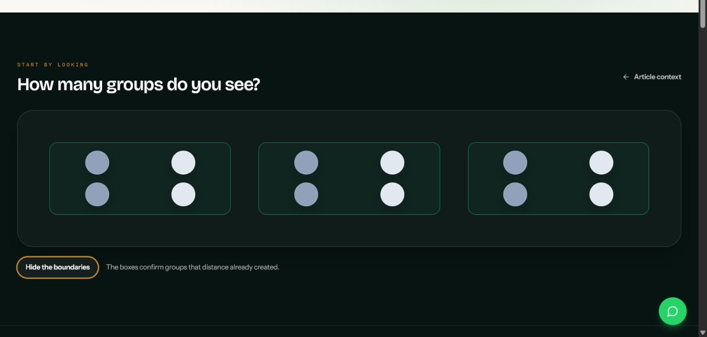
How many groups do you see in the image below?

Most people see three. The dots use the same basic shape, size, and colour. No box encloses a group. No label names one. Distance does the work.
That is proximity in design: elements placed near one another tend to read as related, while greater distance suggests a boundary.
The principle sounds obvious until a layout uses nearly equal gaps everywhere. Then captions float between images, labels lose their fields, prices detach from plans, and responsive controls form accidental groups.
The useful question is not, “Does this screen have enough whitespace?” Ask:
Does the distance between elements match the relationship between them?
The operation: make the inside gap smaller than the outside gap
Imagine an image, its caption, and the next image below it. Two gaps matter:
the inside gap between the first image and its caption; and
the outside gap between that caption and the next image.
When both gaps look equal, the caption sits between two possible owners. When the inside gap becomes visibly smaller, the pair forms before the reader processes the words.
This does not require a universal ratio. A dense data table, a marketing page, and a mobile settings screen need different values. Type size, line length, borders, alignment, and available width all change how a gap feels.
Use one reliable relationship instead:
Space within a conceptual group should read tighter than space between conceptual groups.
That rule also explains why “add more whitespace” can produce a worse layout. More space between a label and its field weakens their relationship. Less space between an unrelated warning and a primary action can create a relationship that the product never intended.
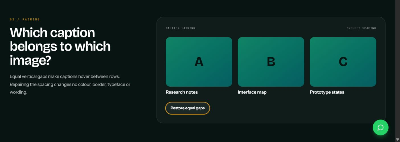
Watch a caption find its image
Picture three images in a row with three captions underneath. In the ambiguous version, the vertical gap above each caption looks almost the same as the gap below it. The captions appear to occupy a separate row.
The repaired version changes one variable. Each caption moves closer to its image, while the next content group moves farther away. The colour, typeface, wording, image size, and alignment remain unchanged.
That controlled change matters. If a “before and after” example changes the border, shadow, colour, type, alignment, and spacing together, it cannot teach you which decision repaired the relationship.
Use this test on galleries, profile lists, dashboard metrics, product images, and article cards:
Cover the captions and observe the image structure.
Reveal the captions without reading them.
Check whether each caption already appears to belong to one image.
Tighten the image-to-caption gap before adding a border or background.
Give every form label a home
A form field usually contains a small local group:
label;
optional hint or requirement;
input; and
error or confirmation message when needed.
The next field begins a new group. If the label-to-input gap and the input-to-next-label gap look equal, the form asks the reader to rebuild those relationships from wording alone.
A clearer vertical rhythm might use a compact gap between label, hint, and control, then a visibly larger gap before the next label. Choose the actual values from your spacing system after the relationship becomes clear.
W3C guidance says designers should maintain a close and distinct visual relationship between a label and its form control. It also describes predictable placement: most labels appear immediately before their fields, while checkbox and radio labels normally appear immediately after the control.
Proximity does not replace semantic HTML. Connect every visible label to its input:
<div class="field">
  <label for="email">Email address</label>
  <p id="email-hint">We send receipts here.</p>
  <input
    id="email"
    name="email"
    type="email"
    autocomplete="email"
    aria-describedby="email-hint"
  >
</div>
Then let the same group control its own internal gap:
.field {
  display: grid;
  gap: 0.5rem;
}

.field + .field {
  margin-block-start: 2rem;
}
The first value binds parts of one field. The second value separates one field from the next. The names and exact numbers can change; the relationship should remain visible.
Remove the card border
Take three pricing cards. Each contains a plan name, a short description, a price, and a billing period.
Now remove every border and background.
Do the prices still belong to the correct plan names? If yes, spacing and alignment already established three groups. The card surface reinforces that structure. If the content collapses into one loose row, the box was hiding weak proximity.
Borders, shadows, and coloured regions create a Gestalt cue called common region: elements inside the same boundary tend to read as related. This cue helps, but it should not excuse random internal spacing.
Fix the sequence in this order:
Group the content correctly in the DOM.
Set a compact internal rhythm.
Create a larger gap between sibling groups.
Align repeated parts.
Add a border or background only when the interface needs stronger separation, interaction affordance, or emphasis.
This approach produces quieter interfaces because every card does not need a heavy visual container.
Do not make proximity and colour argue
Suppose twelve dots form three spatial clusters. Half the dots are mint and half are coral, alternating inside each cluster.
Distance says, “three groups.” Colour says, “two groups.”
People can perceive either organisation, which makes the composition useful as an experiment and inefficient as an interface. A real UI should make its grouping cues agree.
Use typography, alignment, colour, and containment to reinforce the structure that proximity establishes:
keep a heading closer to the paragraph it introduces than to the preceding section;
align metadata that belongs to the same record;
keep an icon closer to its own label than to a neighbouring action;
use colour to show status within a group, not to imply that distant controls form a new group; and
separate destructive actions from routine actions through distance as well as colour.
Colour should not carry the relationship by itself. Readers who cannot distinguish the colours still need to understand the grouping.
Responsive layouts can invent new relationships
A desktop toolbar may place editing controls on the left and account or destructive controls on the right. The large gap between those clusters makes the distinction clear.
At a narrower width, flex wrapping can move the last control in one group next to the first control in another. The source order may remain technically correct while the new visual adjacency tells a different story.
Keep related controls inside meaningful wrappers:
<div class="toolbar" aria-label="Editor toolbar">
  <div class="toolbar__group" role="group" aria-label="Document actions">
    <button>Preview</button>
    <button>Duplicate</button>
    <button>Share</button>
  </div>

  <div class="toolbar__group" role="group" aria-label="Account actions">
    <button>Permissions</button>
    <button>Delete</button>
  </div>
</div>
.toolbar {
  display: flex;
  flex-wrap: wrap;
  justify-content: space-between;
  gap: 1.25rem 2.5rem;
}

.toolbar__group {
  display: flex;
  flex-wrap: wrap;
  gap: 0.5rem;
}
The small gap belongs to controls inside a group. The larger outer gap separates the groups. When the toolbar narrows, each cluster keeps its local rhythm.
Run the same test with longer translations, 200% text zoom, validation errors, and real user data. A component that works only with short English labels does not have a stable proximity model.
Spacing systems provide values, not meaning
Carbon documents a spacing scale based on multiples of two, four, and eight. The U.S. Web Design System uses a constrained palette of design tokens for spacing and other visual properties. These systems reduce arbitrary decisions and make implementation easier to discuss.
They do not tell you which elements belong together.
Starting with “everything uses 16 pixels” creates consistency without hierarchy. Starting with the content model gives the scale a job:
smallest token: label to hint;
small token: hint to control;
medium token: one field to the next;
large token: one form section to the next.
The sequence matters more than any example value. If two tokens look indistinguishable in the actual component, they will not communicate a boundary simply because their names differ.
Visual grouping needs semantic structure
Max Wertheimer's 1923 work on perceptual organisation described how people experience organised forms rather than an arbitrary sum of individual sensations. Interface designers can use spacing to make those forms obvious to sighted readers.
But CSS does not create a programmatic relationship.
WCAG 2.2 Success Criterion 1.3.1 requires information, structure, and relationships conveyed through presentation to remain programmatically determinable or available in text. When visual styling changes or a screen reader presents the page, the HTML must still explain what belongs together.
Use the element that owns the relationship:
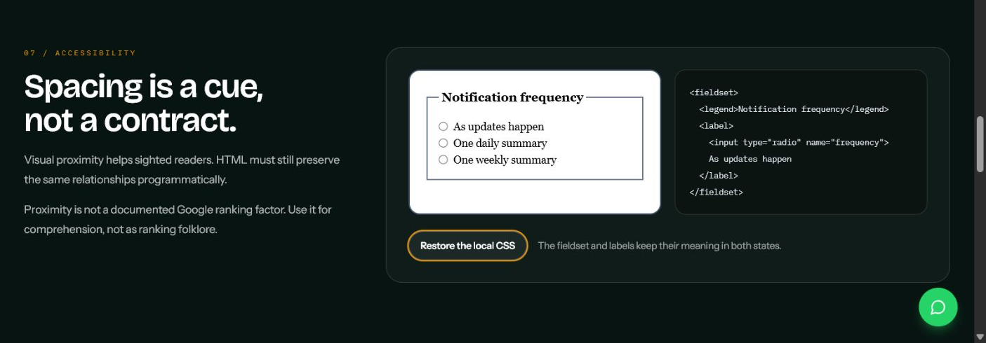
<fieldset>and<legend>for a group of related form controls;<label>for a control's visible name;headings for content sections;
<ul>or<ol>for lists;<table>with correct headers for genuinely tabular relationships; andlandmark elements such as
<nav>,<main>, and<aside>for page regions.
The interactive article demonstrates this by removing local CSS from a radio group. The polished spacing disappears. The fieldset, legend, labels, and inputs still preserve the meaning.
Think of the responsibilities this way:
CSS communicates the relationship visually. HTML preserves the relationship structurally.
For SEO, keep the boundary precise. Proximity is not a documented Google ranking factor, and Google publishes no preferred spacing value or proximity score. Google's SEO Starter Guide recommends readable, well-organised content, while semantic HTML helps systems and assistive technology interpret page structure. Use proximity to reduce reader confusion—not as a ranking trick. If you need the broader search foundation, read What Is SEO?.
Run a proximity audit
Choose one form, toolbar, card grid, content section, or settings screen. Then try to break its grouping.
Blur the interface
Squint at the screen or apply a small blur. Fine text and icon detail disappear while large spatial groups remain. If the page becomes one grey mass, its section boundaries may be too weak. If every item becomes an isolated island, internal gaps may be too large.
Remove borders and backgrounds
Temporarily disable card surfaces, dividers, and tinted regions. Check whether headings, values, captions, and actions still attach to the correct owner. Repair spacing before restoring the containers.
Narrow the canvas
Test at 320 CSS pixels as well as the widths your project supports. Watch which items become adjacent after wrapping. Make sure a destructive action, status message, or helper text does not drift toward the wrong group.
Lengthen the content
Replace short labels with realistic long ones. Add an error message. Increase text size. Insert a two-line title. Strong grouping should absorb content changes without reassigning relationships.
Disable CSS and inspect the DOM order
The reading sequence should still make sense. Labels should still name controls. Group legends should still introduce their choices. Headings should still organise the content.
A compact implementation checklist
Define conceptual groups before choosing spacing values.
Keep internal gaps visibly tighter than the separation to the next group.
Align repeated parts so that spacing does not fight the grid.
Make typography, colour, and containment reinforce the same grouping.
Wrap related controls so responsive layout preserves them as units.
Encode relationships with semantic HTML and explicit labels.
Test without borders, with blurred detail, at narrow widths, with longer text, and in DOM order.
Proximity succeeds when the interface requires less reconstruction. A caption already belongs to its image. A hint already belongs to its field. A price already belongs to its plan. The layout becomes quieter because the space is carrying information.